The library website. Where do I even start?
ugly as boo
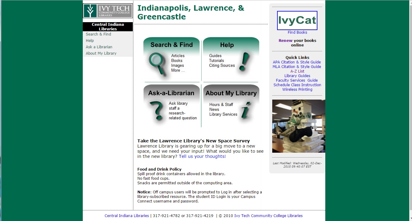
I’m really not trying to insult whoever designed this. It was created in 2005, so it was probably closer to “state of the art” back then. By the time I arrived on the scene in 2014, this thing was screaming for a remake:
Just. No.
It’s hard for me to remember the online world in 2005 and how this fit into it, but I’ll try. I didn’t join Facebook until 2006, so that helps me remember how things were back then. This is before widescreen monitors were a thing and before the iPhone was household name.
In theory, it should’ve been updated bit by bit over time, but Ivy Tech is notorious for not hiring people to do things that already-hired people might know how to do, so I’m assuming this fell into that category. And it sat around for 10 years. All the while, librarians were fitting more and more information into little tiny spaces that weren’t designed for that kind of thing. Case in point: the right sidebar on the homepage. This spot became a catch-all for anything that took “too many clicks” to get to, which (come to find out) was most things.
To a web designer, that’s a giant red flag that there’s a usability problem that’s being patched instead of reworked. It needed to stop.
where I stepped in
In the spring of 2015, I was promoted (huzzah!) and subsequently joined what is known as the LibGuides Task Force (LGTF) for Ivy Tech Libraries. The task force is made up of library staff (directors, librarians, and assistants) from across the Ivy Tech system and was originally formed in order to create statewide policies, procedures, and best practices regarding our LibGuides and LibAnswers platforms. I was added to the task force because of my unofficial role in our region as the “tech guru.”
I’m sure I’ve made everyone on the task force crazy with all my thoughts and ideas. Almost from day one, I came at them with usability questions and had them consider what our website was really there for. When most of the task force agreed that the site was out of date and students couldn’t find what they needed for assignments, I got to work designing a new one. I had ALL THE THOUGHTS and ALL THE PROTOTYPES, but in the end, we decided to go with an iterative design process so students (but really faculty) wouldn’t get so freaked out by a radically different design.
here’s how that went down
The main catalyst for the new website was actually our CMS. The previous CMS was no longer being supported by its company. By the time we switched to LibGuides CMS, we could no longer log in to the old CMS, which was very inconvenient. The most inconvenient part about it was that we couldn’t get any of the our current website exported to the new CMS, meaning we had to recreate anything we wanted to keep by painstakingly copy/pasting from the old site to the new CMS. Needless to say, it was awful.
Since we decided on an iterative design process, the new site was pretty similar to the old site. The layout and content was exactly the same, but the “look and feel” of the website was more aligned with the college’s style guide. Most importantly, the new site was also mobile-friendly. Win-win. If it had been up to me, we would have pulled off the band-aid and gone straight to a new site design completely, but it ended up working out that we stuck to the old design. The new design would come along shortly anyway, so I didn’t have long to wait.
Next up: new site and new cms