The transition to the new CMS was challenging, but once we were there, everything was easier. Having draft pages and linked assets was a game changer.
Everyone on the task force was already familiar with LibGuides, so choosing to host our site with Springshare was a win-win no-brainer. We reasoned that most staff around the state had some ability in editing LibGuides, and since the website is more or less a LibGuide, people shouldn’t have much of a problem editing their own content. The old CMS was clunky and buggy, and no one ever wanted to edit it (see the screenshot on the previous post for evidence of the awfulness). With a simple CMS, there could be no (legitimate) excuses for outdated content.
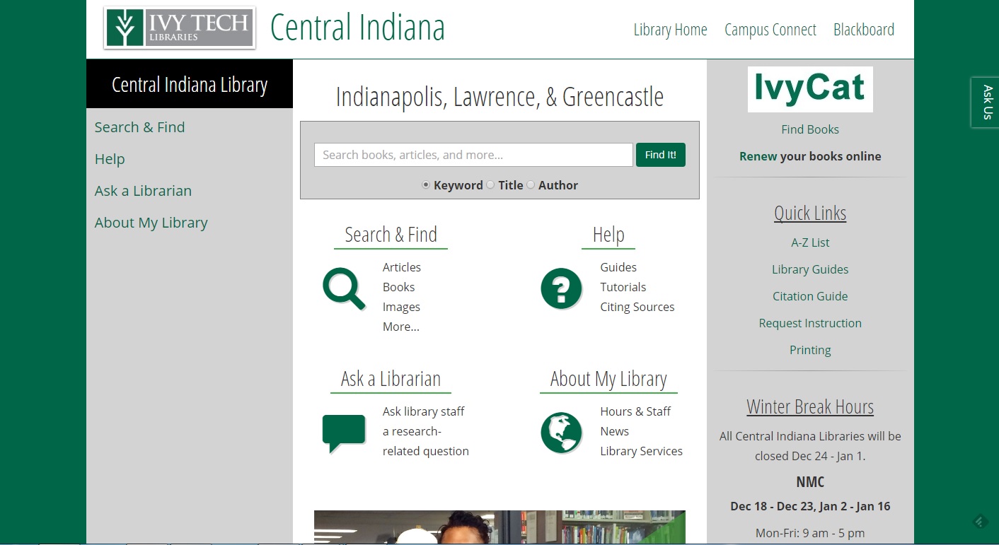
updated, but still bad
The new site was definitely a step in the right direction. As mentioned in the previous post, we decided to stick with a copy of the old site with some updated styling choices to stay more closely aligned with the college’s style guide.
Here’s the result of that update.

Updated, but still bad. The navigation was all wrong, and the architecture underlying it was worse. None of the pages were intuitive, and users were constantly guessing (!) where they should click to get to the information and resources they needed.
As you may know if you work with humans in any capacity, change is hard for most people. Updating the website took more than just coding and migrating content– it meant changing the minds of people who had been seeing the same site for the past ten years. I won’t say that everyone was against it, but it was hard to get people on board.
Once the new version of the site was out in the open, it was my mission to remind everyone that this was just step one in a new ever-evolving library website. To train librarians and library staff that the website would be updated frequently (and they should get used to it) was a major challenge.
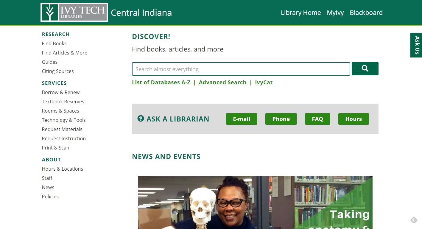
breath of fresh air
Speaking of an ever-evolving library website, I convinced the task force to let me do another major update just one year after the first major update. Most everyone on the task force agreed that the latest version just wasn’t cutting it in the user experience department, so they were on board with a revamp (and I will be eternally grateful that they went along with my crazy scheme).
In January 2017, we rolled out the latest look.

Not only did this change the style (hellooooo, 2017!), it also gave the regional libraries the autonomy to update their navigation and content layout if they so chose. We now have 14 differently-organized library websites, and I think it’s amazing.
room to grow
We’re definitely not done yet. LibGuides as a CMS makes doing some of our consortial tasks difficult, but we’re handling it the best way we can. I ask for ideas from the task force, then come up with small, creative solutions over a very long period of time. Case in point: it took me 3 months to devise a guide filtering system (post coming soon…).
I’m excited to see where the website will go next. Stay tuned!